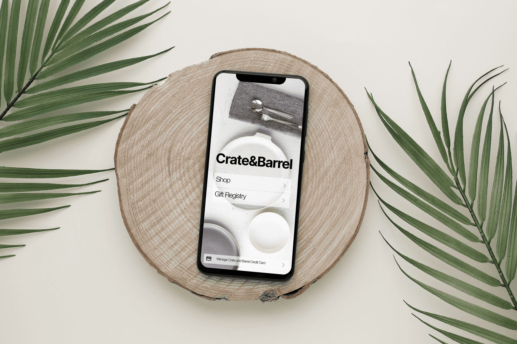
Crate & Barrel
Simplifying gift registries on the go. Create, manage, update, and search Crate & Barrel registries effortlessly from anywhere.
Reflection & Conclusion
By simplifying the registry process, I transformed the user experience for Crate & Barrel shoppers. The app now aligns with users' needs, making gift-giving and registry management easy, fast, and enjoyable, whether they're shopping for their own home or selecting the perfect gift.
Key Takeaways
Centralized Hub: A dedicated registry section for seamless management.
Effortless Navigation: Streamlined user flow for easy access and updates.
Mobile-First Convenience: Empowering users to manage their registries anytime, anywhere.
Prototype
The Missing Piece
Imagine you live somewhere were there isn't a Crate & Barrel. You are using the Crate & Barrel mobile app to buy a gift from the registry. You’re excited, but after several taps, frustration sets in—you can't find the registry. You try again, navigating back and forth, but the process is slow and unintuitive. You wonder why such a key feature isn't easier to access. This was the reality for many users, and it sparked my mission to simplify the Crate & Barrel registry experience.
Goals
Centralized Registry Hub
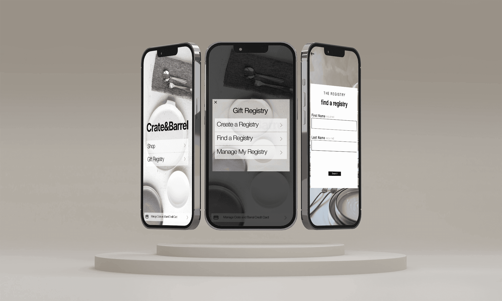
Create a dedicated space within the app for users to easily create, find, and manage their registries.
Streamlined Navigation
Ensure users can quickly browse, add, or remove items from their registry, without any hassle.
On-the-Go Convenience
Empower users to make registry updates from anywhere, turning a complex process into a seamless mobile experience.
Designing the Solution
My journey started with identifying the core user pain points. I noticed that navigating through different menus were missing key features like creating, managing, and searching for a registry. Inspired by sleek, intuitive apps from the e-commerce space, I set out to design a smoother, more engaging experience.
The vision was simple: a user could view, modify, share, and even search for their registry without ever feeling lost.
The solution centered around a fully revamped, mobile-friendly interface with dedicated registry management features. A clear, intuitive dashboard became the heart of the app, allowing users to navigate easily between adding items, viewing lists, and making updates in real-time.
The new "Registry Hub" eliminated confusion and frustration. Users could now manage everything from their phones—no more desktop toggling or guesswork.

