Airbnb
Effortless group travel with seamless cost-sharing. Simplified payment tracking and intuitive reminders make splitting expenses stress-free.
Reflection & Conclusion
The moment of truth arrived during our final presentation. Our peers and instructor responded with enthusiasm, praising our solution for effectively addressing user needs while aligning beautifully with Airbnb’s mission of fostering a sense of belonging. This project was not just a success; it was a transformative experience that deepened my skills in teamwork, user-centered design, and adaptability.Collaboration was key to the success of this project. I worked closely with Spencer and Allison, integrating their insights from user research and wireframing into the visual design. Regular check-ins allowed us to align our visions and make adjustments in real-time, fostering a creative and productive environment.This project encapsulates my passion for crafting meaningful travel experiences and my commitment to user-friendly design. I look forward to carrying these lessons into future opportunities, where I can continue to innovate and enhance user experiences, one adventure at a time.
Prototype
Why must we use another app to travel?
Our journey began with heartfelt conversations. We turned to friends and family, gathering stories about their travel escapades. It didn’t take long for a pattern to emerge: the challenge of splitting costs often led to confusion and frustration. Many longed for a straightforward, transparent way to manage payments and track who owed what. Armed with these insights, we set off on a brainstorming adventure, eager to design a solution that would streamline the booking process.
Goals
Improve Payment Tracking
Develop clear and accessible tools for users to view total costs, individual shares, and payment statuses, ensuring transparency and accountability among group members.
Enhance User Experience
Create an intuitive and seamless payment process that simplifies the logistics of splitting costs among group travelers, reducing confusion and frustration during the booking experience.
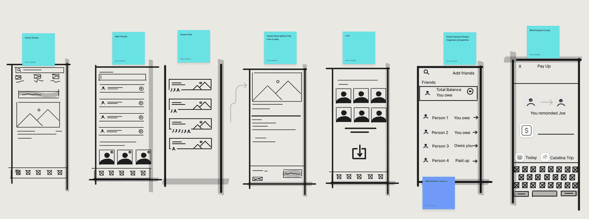
Ideation & Wireframing
My journey began with a deep dive into user experiences, where I conducted interviews and observations to truly understand the needs of United Airlines customers. I crafted personas representing this diverse audience, both Frequent Flyers & Leisure Travelers. Through their eyes, I uncovered key frustrations: endless loading times, convoluted navigation, and the anxiety of managing flights on the go.
I analyzed competitor apps, identifying standout features like scrollable interfaces and real-time updates. These observations laid the groundwork for my redesign.
I translated my vision into wireframes, with each sketch bringing my concepts to life. Using Figma, I developed an interactive prototype that allowed users to navigate the app as if it were real.
To ensure my wireframed design met user needs, I gathered a diverse group of testers. Their mission was to navigate the new app design, completing tasks like finding flight status and changing reservations.
Users expressed relief at the single-page design, appreciating the reduction in frustration. Many noted that the new inline management feature made modifications feel intuitive and immediate.
Designing Key Components
As the visual design lead, I set out to craft an interface that resonated with Airbnb’s brand while infusing it with our unique perspective. Using Figma, I brought our ideas to life, designing key components that would become the backbone of our solution
User-Centric Design:
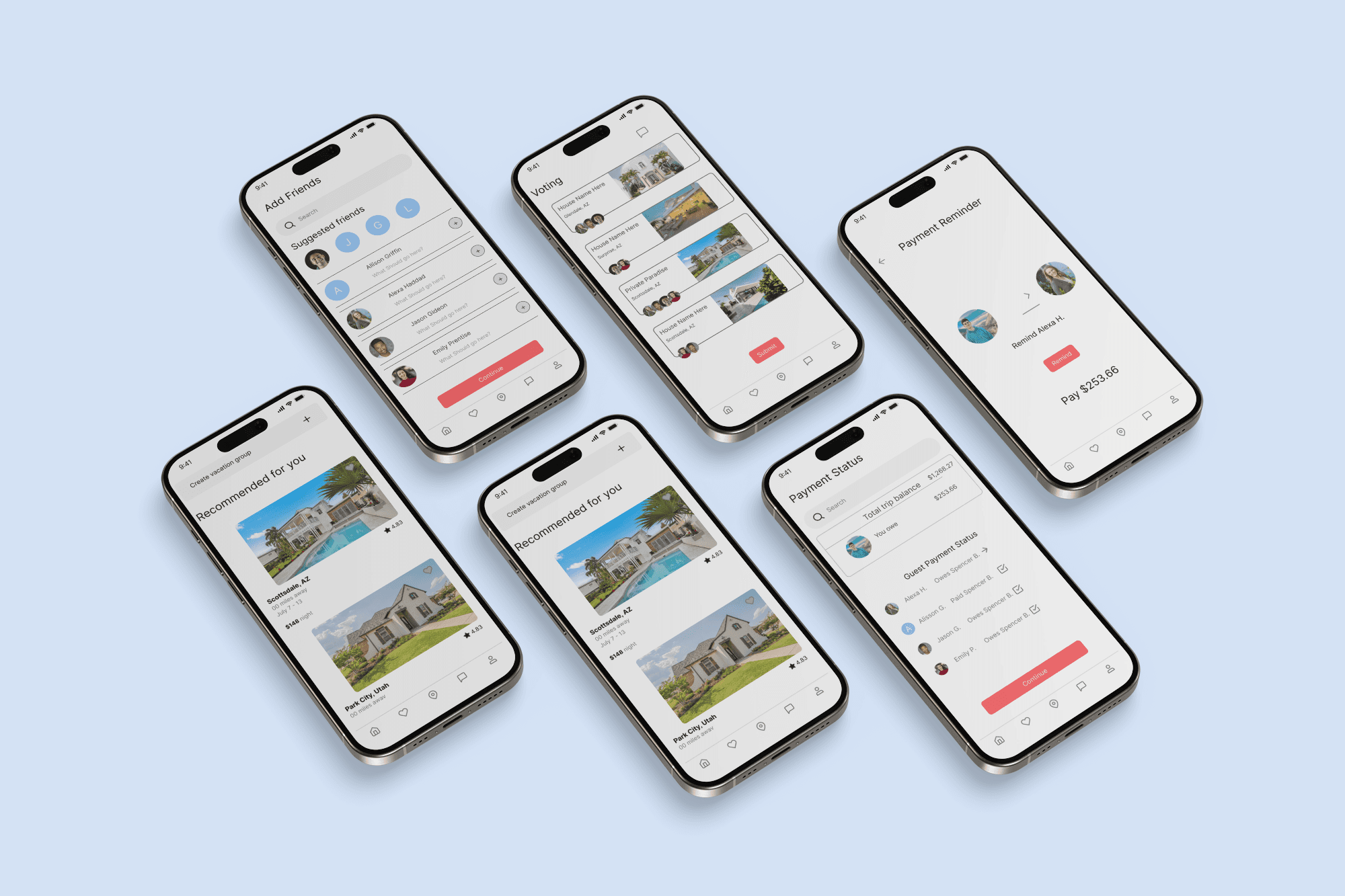
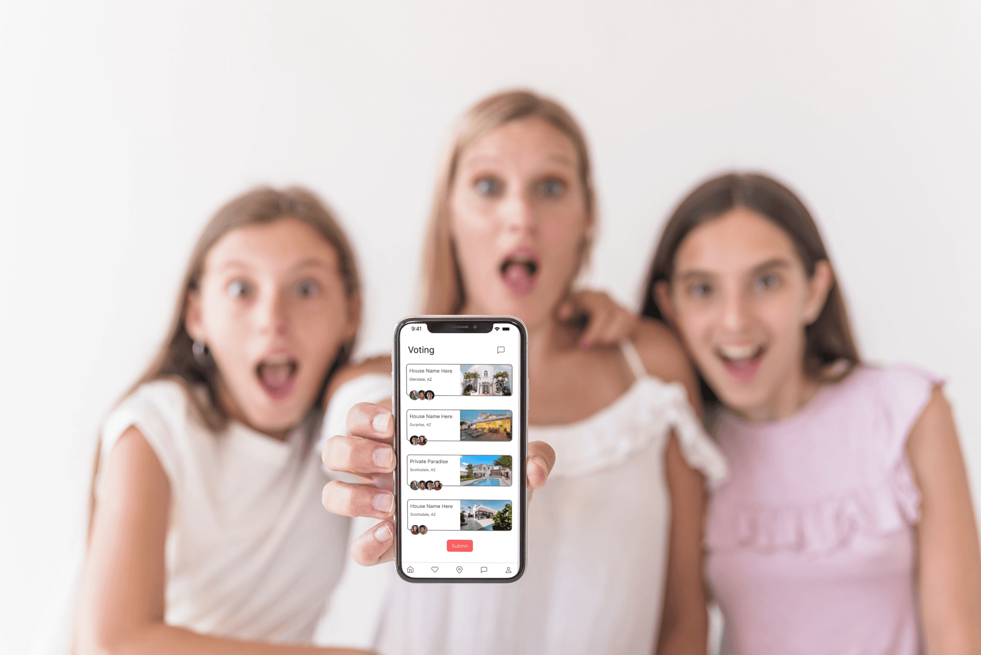
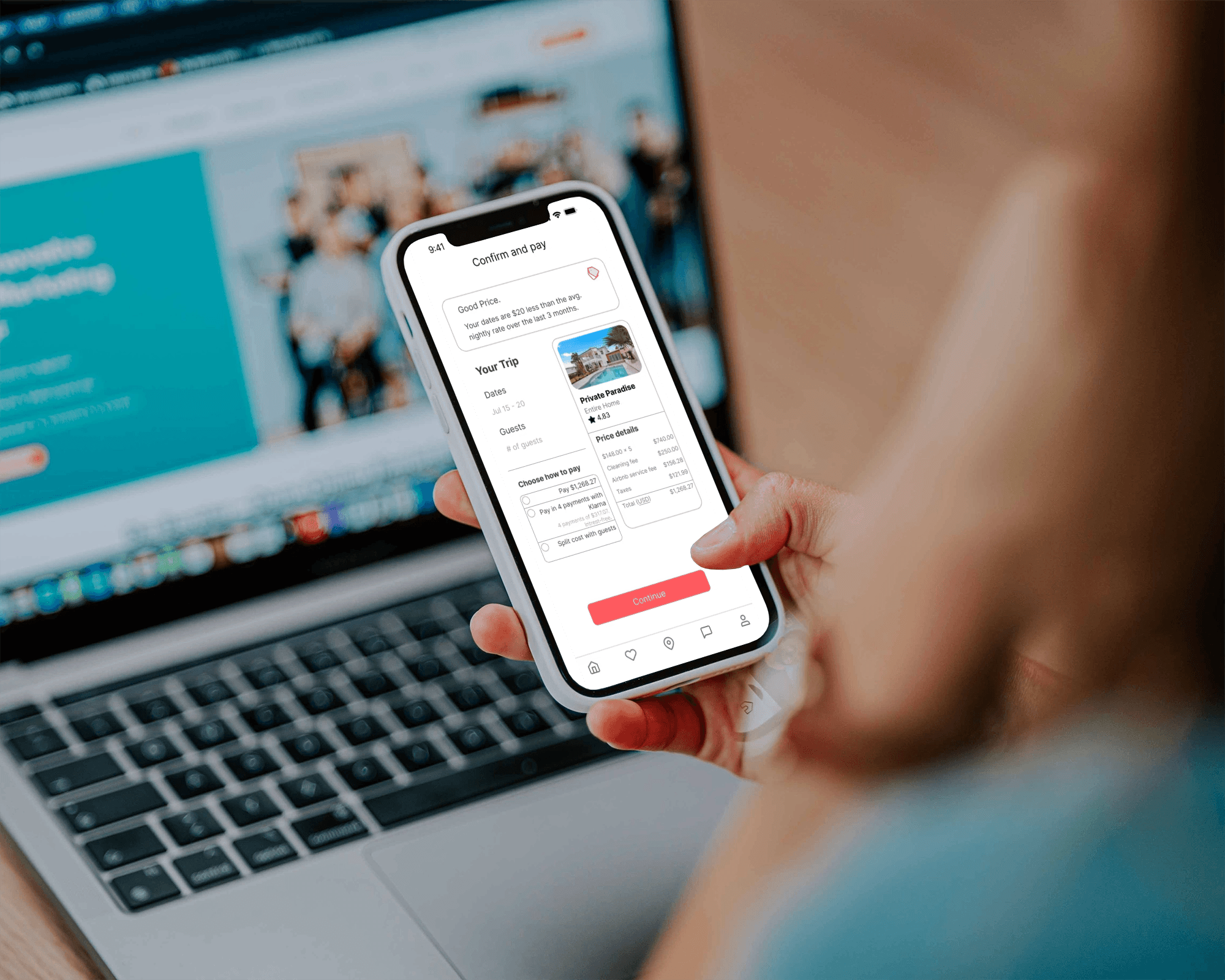
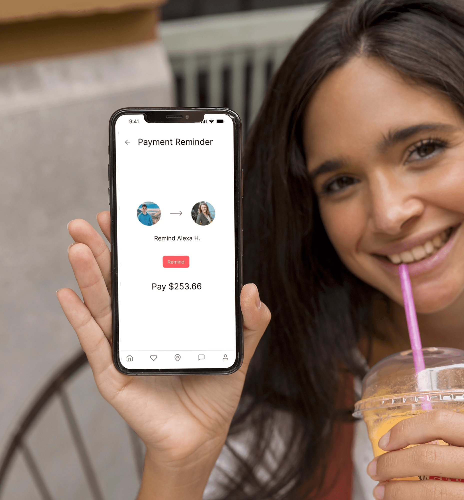
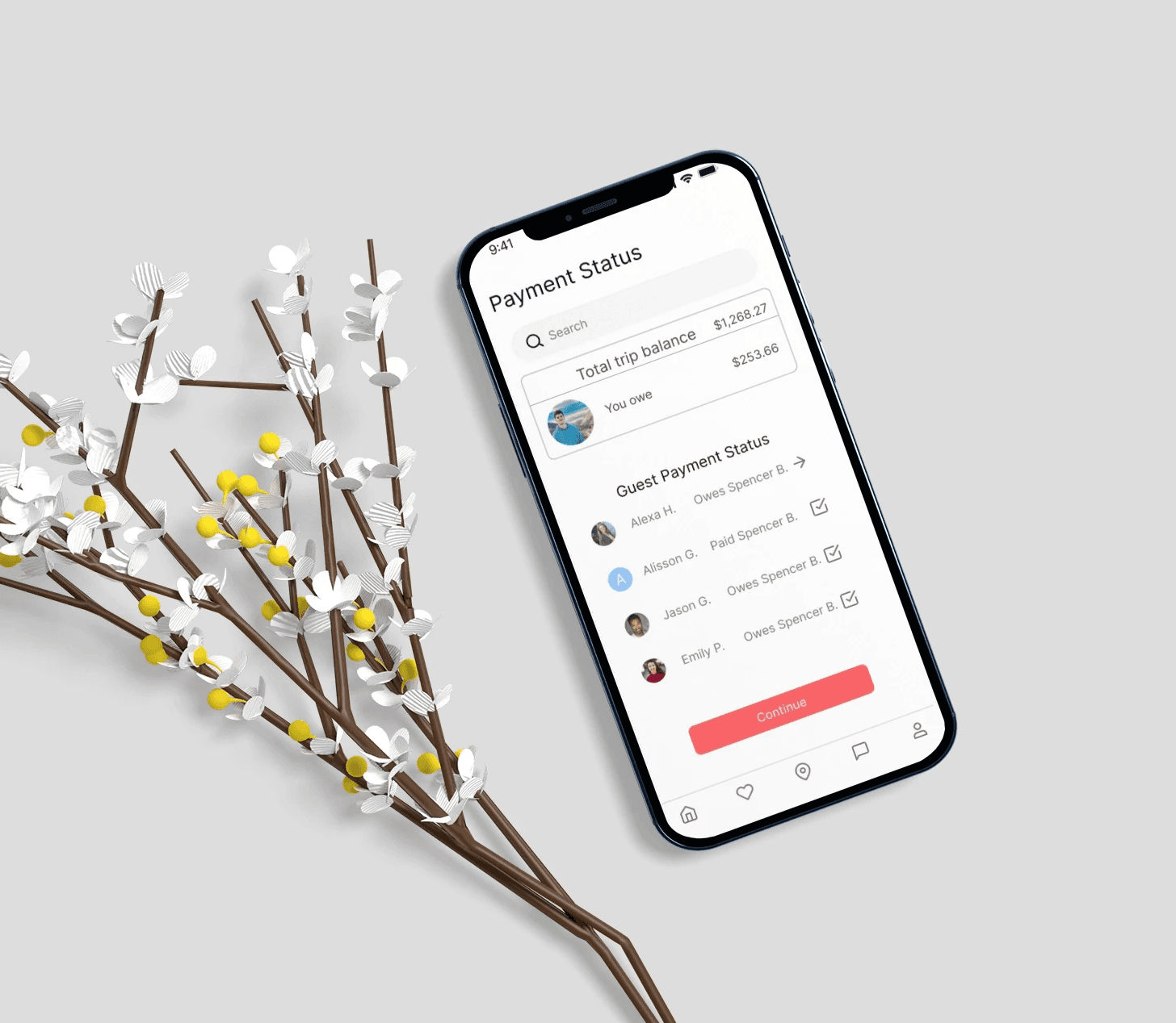
Throughout the design process, we adhered to user-centric design principles. We conducted multiple iterations, incorporating feedback from usability testing to refine the interface. Real user insights were invaluable, helping me identify areas for improvement and ensuring that the final design met the needs of our target audience. To enhance the user experience further, I integrated intuitive swipe features throughout the prototype. Users can start by creating a new vacation group, where they input details about their trip. As they navigate through the app, they can swipe through listings, such as the beautiful "Private Paradise" home, allowing for a visually engaging selection process.Once they’ve made their choice, the app guides them to the split payment option, where they can easily manage and customize their payment shares. They can also check payment statuses with a simple swipe, providing quick access to information on who has paid and who still needs to contribute.Additionally, reminders can be sent to those who need to pay, making it easy for users to ensure everyone is on track without any awkward conversations.
Split Pay Dashboard
A clear and inviting overview where group members could easily see total costs, individual shares, and payment statuses.
Payment Request Notifications
Thoughtfully crafted alerts that informed users of their responsibilities without overwhelming them.
A simple visual representation that indicated who had paid and who still needed to contribute.
