United
Empowering travelers with quick, easy flight management. With a simplified app navigation for efficient flight management.
Prototype
A Journey Worth Taking
This project was more than just a redesign; it was a testament to the power of empathy and understanding user experiences. By transforming a frustrating process into a seamless interaction, we can empowered travelers to take control of their journeys, no matter the circumstances. A successful implementation of this design is just the beginning, in an ongoing journey to enhancing the travel experience, one app update at a time.
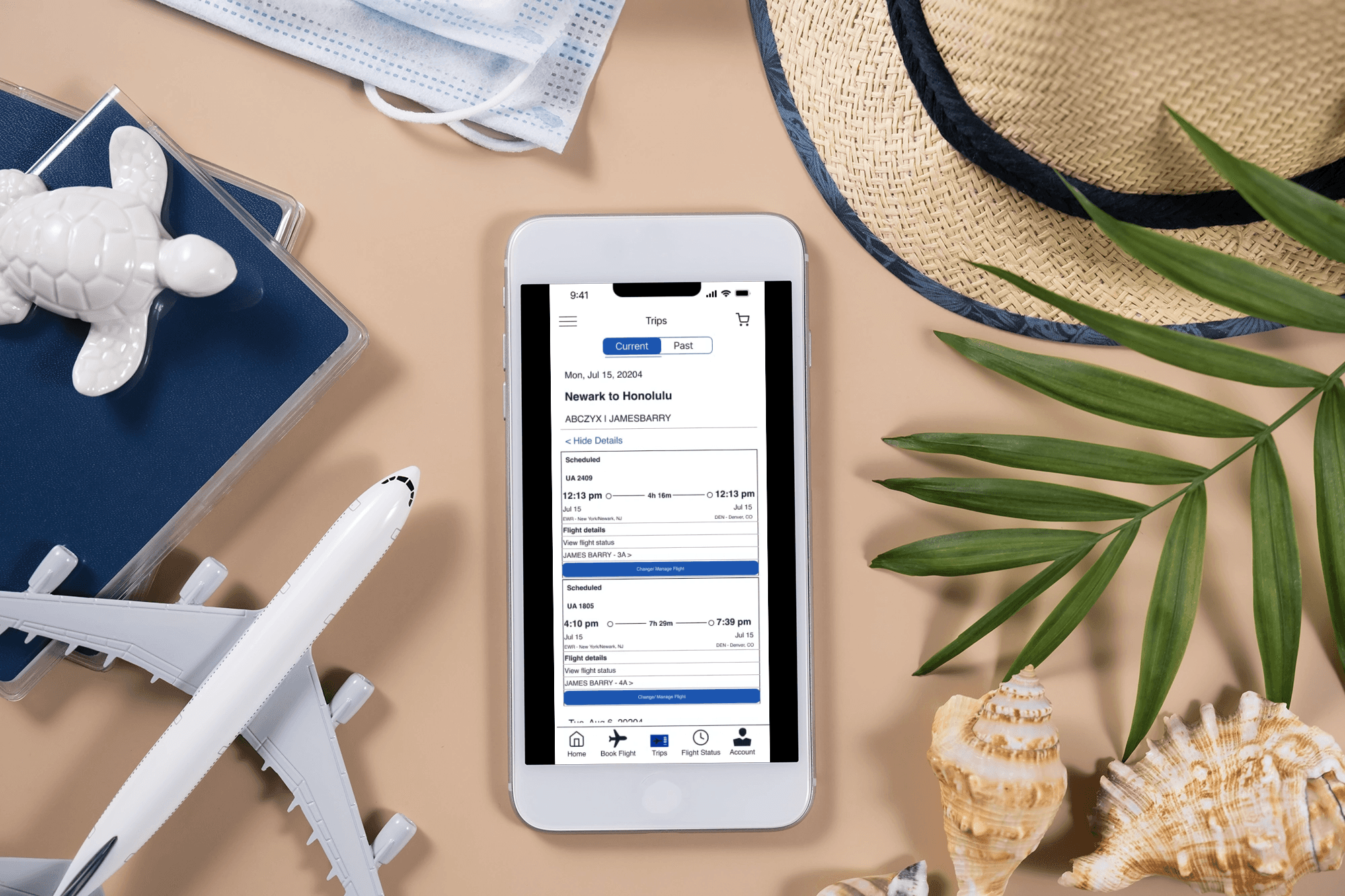
Expandable Flight Information Section
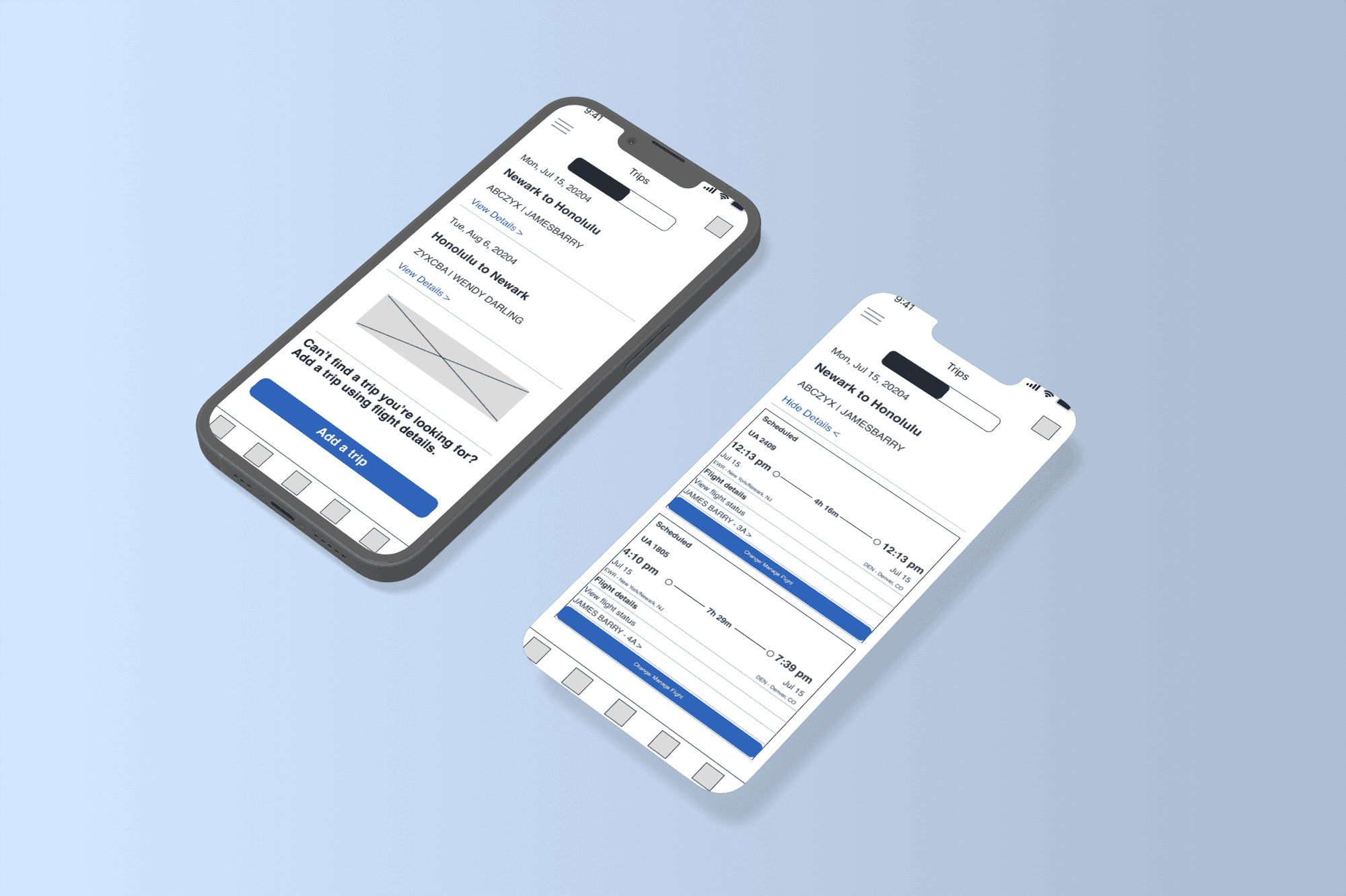
Inline Reservation Management

Key Takeaways
Seamless Navigation: Streamlined app flow to reduce loading times and enhance user efficiency.
Real-Time Updates: Instant access to flight status and gate changes on a single page.
Easy Modifications: Quick booking changes directly within flight details for user convenience.
Imagine you’re on the tram at the airport, riding from Gate A traveling to Gate F, balancing a coffee in one hand and your phone in the other. You glance at the clock and realize your layover is slipping away. You need to switch flights due to a last-minute change, but the United Airlines app is lagging—screen after screen taking forever to load. The Wi-Fi is weak, and your frustration mounts with each passing minute. This was my reality, and it ignited a desire in me to create a solution.
As a UX/UI Designer and a frequent traveler, I’ve experienced the agony of poor app performance at the worst times. I knew I wasn’t alone; countless travelers face similar struggles. This personal experience became my mission: to enhance the United Airlines app and empower customers to manage their flights seamlessly, even in challenging conditions.
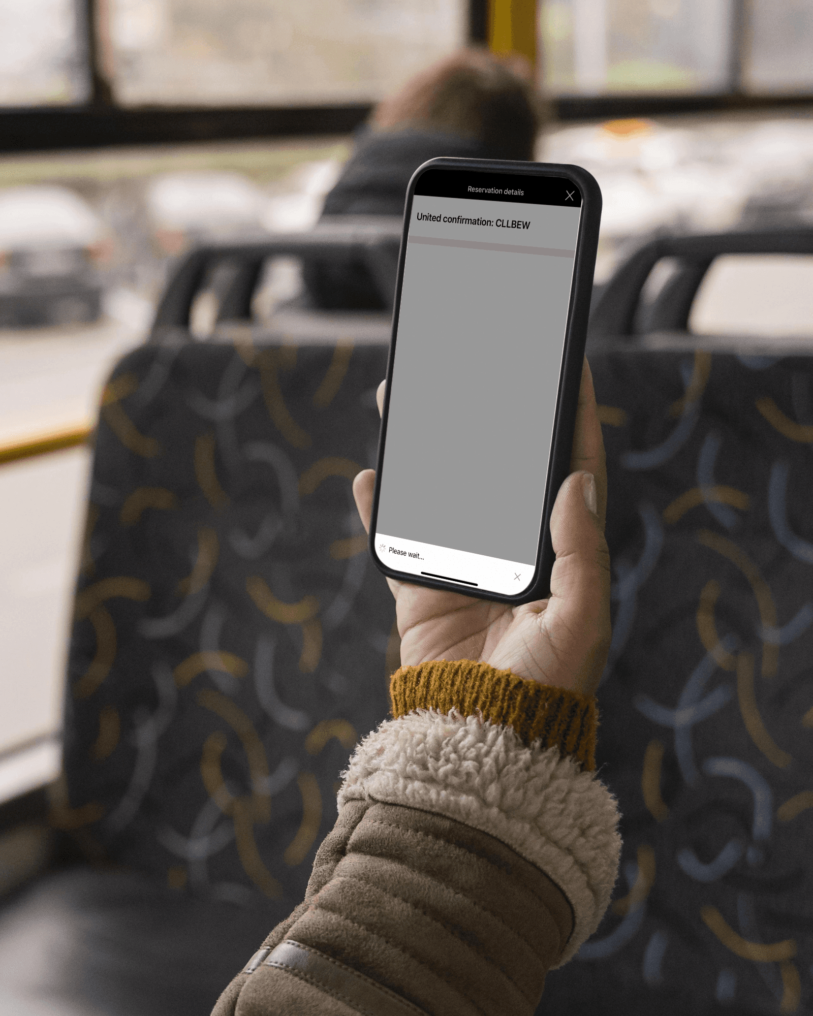
The Loading Screen of Death
Goals
Seamless Navigation
Streamline app flow to reduce loading times and enhance user efficiency.
Real-Time Updates
Provide instant access to flight status and gate changes on a single page.
Easy Modifications
Enable quick booking changes directly within the flight details for user convenience.
Ideation & Wireframing
My journey began with a deep dive into user experiences, where I conducted interviews and observations to truly understand the needs of United Airlines customers. I crafted personas representing this diverse audience, both Frequent Flyers & Leisure Travelers. Through their eyes, I uncovered key frustrations: endless loading times, convoluted navigation, and the anxiety of managing flights on the go.
I analyzed competitor apps, identifying standout features like scrollable interfaces and real-time updates. These observations laid the groundwork for my redesign.
I translated my vision into wireframes, with each sketch bringing my concepts to life. Using Figma, I developed an interactive prototype that allowed users to navigate the app as if it were real.
To ensure my wireframed design met user needs, I gathered a diverse group of testers. Their mission was to navigate the new app design, completing tasks like finding flight status and changing reservations.
Users expressed relief at the single-page design, appreciating the reduction in frustration. Many noted that the new inline management feature made modifications feel intuitive and immediate.


